Archive | Dining Room

Before and Aftah Dining Room

I’m all about a pop of color and I love when clients embrace a fun color scheme in their home, but this…well…let’s just say it wasn’t living up to their dream of having an elegant dinner party.

Time for a DoOvah!
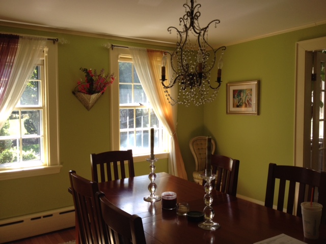
image_6Oh, and did I mention that this photo facing the windows didn’t fully capture the, um, POP that the color makes?  Kinda loud, huh?
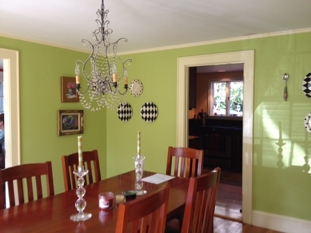
image_7So clearly we had to address the color, but let’s face it, there was nothing special about the dining table and chairs either. This doesn’t look like a place you are going to want to sit and linger with friends long into the night.  But we did like the chandelier…yeah that can stay!

Dining RoomPhoto by: Michael J. Lee

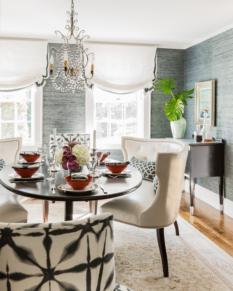
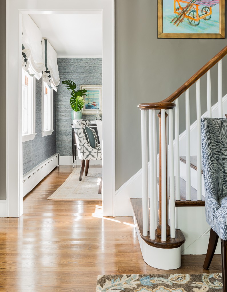
I AM IN LOVE!  Seriously.  That Phillip Jeffries grasscloth wallpaper speaks for itself.  I literally want to put wallpaper in every single DoOvah these days!  The Schumacher fabric on the chairs brings in a fun youthful vibe for these empty nesters.  It’s such a cozy space, don’t you just want to linger here with a few too many glasses of wine?  Throw pillows…in a dining room…YES PLEASE!  Honestly, I’ve wanted to use Mary McDonald’s Don’t Fret from the moment I saw it, and the pillows on these leather Wesley Hall curved settees was the perfect spot.  Here we are discussing these pillows…or the wine…or the band at the party…or how we’ll be best friends for life…whatever.
IMG_3428I digress.  The dining room.  We are talking about the dining room DoOvah.  Anyhoo, we already told you that we kept the chandelier, but we also incorporated the rug from the living room DoOvah to use in this space.  Finally, we refinished the top of the buffet in a silver leaf and moved it to a wall that was better proportioned to the scale of the piece.
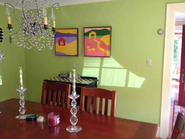
image_10Big wall + tiny buffet = doesn’t work.  Adding the silver leaf to the top brings elegance to the original kitchy country checkerboard pattern.  Since we were working on so many spaces in their home, the homeowner  was so glad we were able to reuse a few pieces in the new design.
Hall

Photo by: Michael J. Lee

We hope our clients spend many hours in their new dining room sharing stories and creating memories with friends and family, because let’s face it, that what these spaces are meant for.  Does your dining room need a DoOvah too?

2

I’m Thankful For….

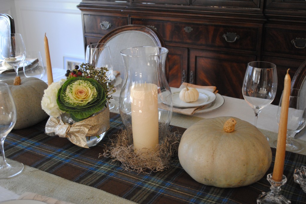
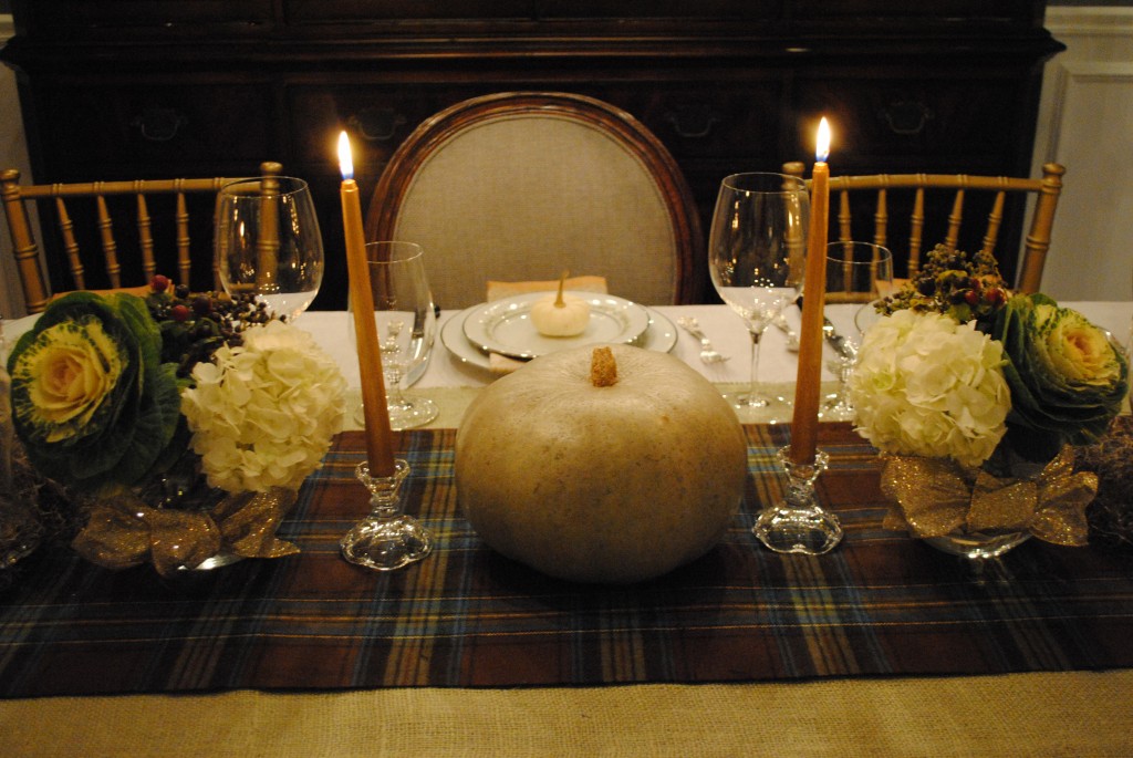
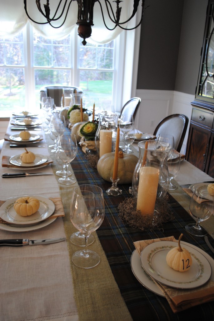
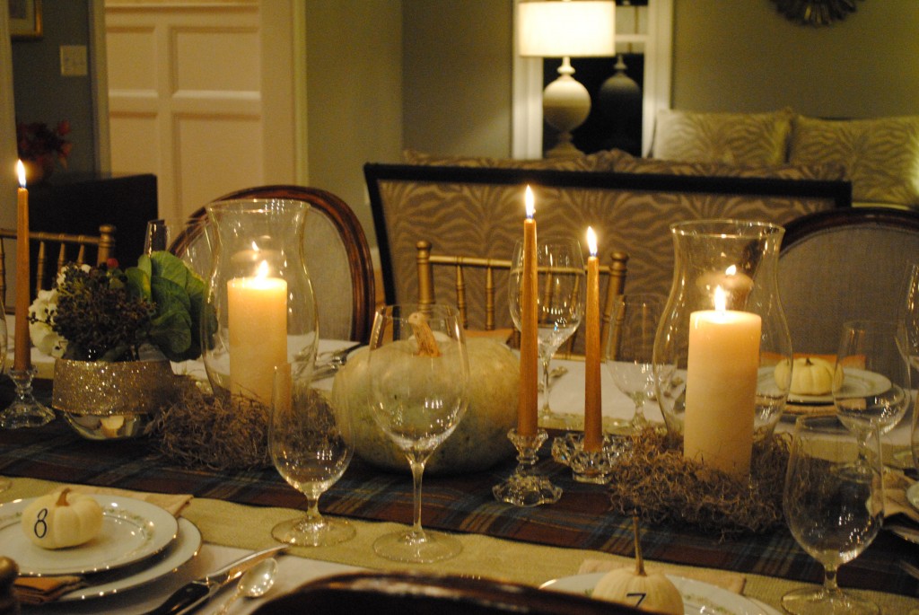
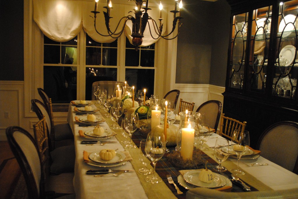
BURLAP (among other things of course)  But seriously I am always thankful for a fabulous utility fabric that you can use over and over again.  This year, I started with a simple white linen table cloth and overlaid it with a few yards of beautiful silver sage burlap (in that fab color…still only $3.99 a yard) paired it with a flannel tartan for an elegant fall tablescape.  Did I mention that I didn’t sew ANYTHING?!?  That’s right, a couple of yards of flannel fabric with a built in “cut here” line.

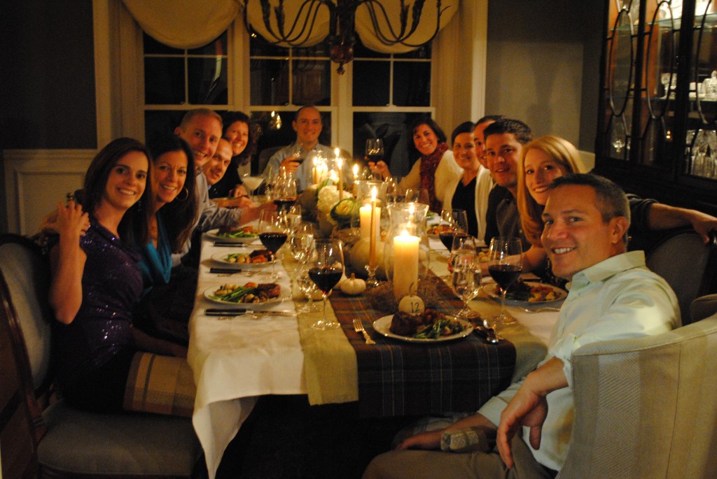
The inspiration for this Thanksgiving table setting came from the Blue Moon Squash I found at Idylwilde Farm last week.  Did you see my post on facebook?  In all honesty, this was to be my first dinner party at our new dining room set (I totally feel like a real grown up now) and I wanted the colors of the decor to match said furniture.  Nailed it!

New Squash Meet New Chair

My “newly retired” mom (congrats Peg O’Toole) is in the process of downsizing again, so I inherited her wedding china as well (see what I mean…total grown up territory!)

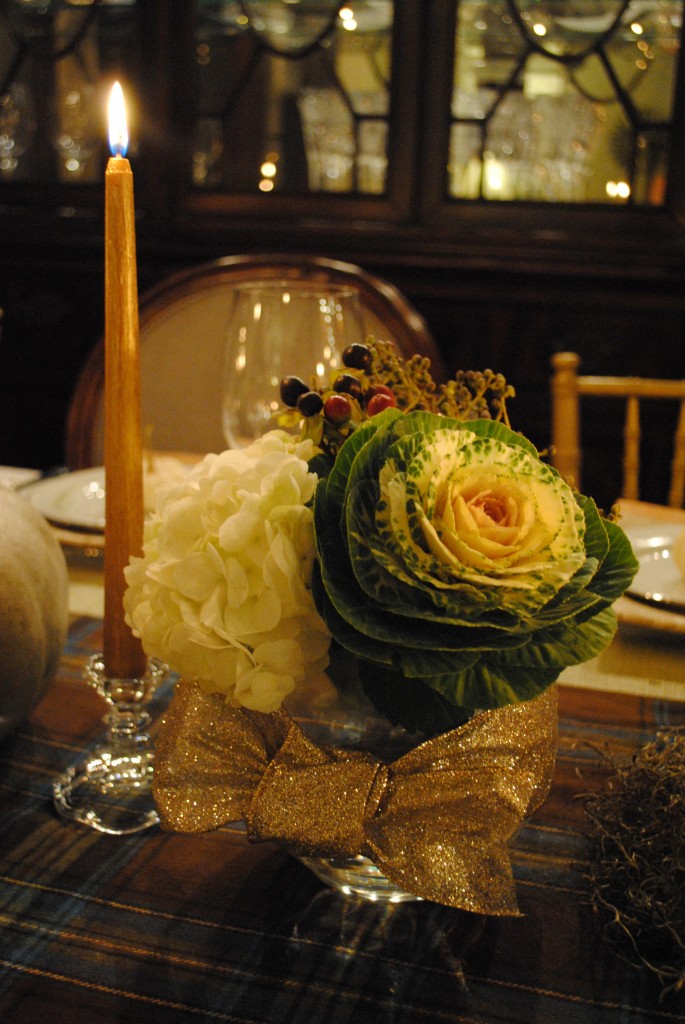
And here is a close up of a super simple flower arrangement. Hydrangea & Flowering Kale, are some on my favorites for fall centerpieces!

Don’t forget to add moss around the bottom of the hurricane candles for texture!

I was just so happy with how the whole table came together…and the food, well that’s another story for a different sort of blog!

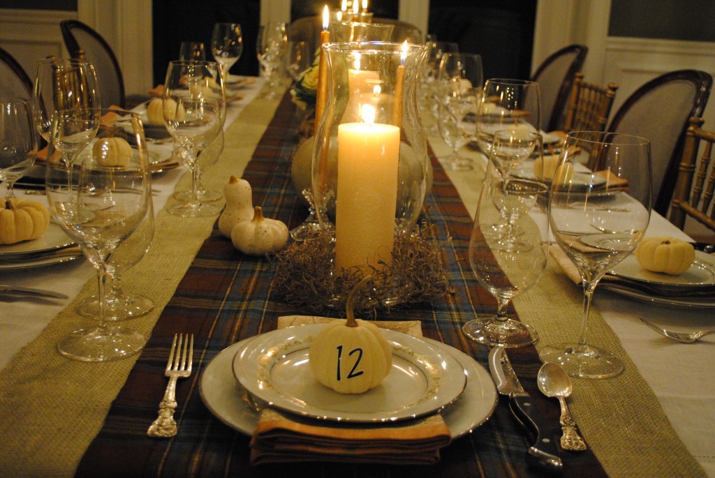
And are you wondering about the numbered pumpkins?  Truth be told, this isn’t really my Thanksgiving table…in fact, I’m not even hosting this year!  (But don’t totally put it past me to set my table weeks in advance)  This post was inspired by a dinner party I was hosting.  As each of my guests arrived I had them pick a number which corresponded to seat for suppah!  Although some couples actually ended up sitting net to each other, it was a fun way to let fate decide how the night progressed. (And some chairs were clearly more comfy than others).

Happy Thanksgiving Everyone

0

It’s Do-Ovah Time

Do-Ovah’s are my favorite part of the job!  They really educate and motivate my clients to be able to do something creative with their spaces on their own.  I feel like such a proud momma when I hear from them that they completed what we talked about and they love it.  The downside of the Do-Ovah for me is that I don’t always get to see the finished product.  But sometimes, a client finishes it AND sends me proof.  Here are just a few do-ovah’s from the past few months…

DO-OVAH #1 – Concord, MA

This do-ovah was for a client who was moving to the area and had to make all the decisions from several hours away.  She hired me to help out with the kitchen & family room area that had a confusing layout and clearly dated built-ins.

BEFORE

Her style is light and bright cottage feel, and we went through her Pinterest Boards (best design tool eva) to see what ideas she had for the space.  It was not in the budget to rebuild the bookshelves, so we had them painted white and added crown molding at the top to lose the scalloped edge for a less 70’s feel.  The trim around the windows was also painted white and the walls were painted in Benjamin Moore Sliver Sage 506.  They are thrilled with the transformation…now onto the furniutre options.  I hope they keep me posted!

AFTER

DO-OVAH #2 – Acton, MA

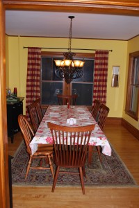
This client lives in a beautiful historic home with lots of charm.  They hired me for several rooms in their home, but for their dining room in particular they wanted to give it a whole new look, but didn’t really want to paint.  Um, yeah about that…

BEFORE

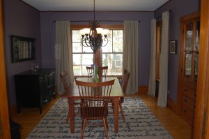
Often times people think that if they have the dark woodwork in historic homes they shouldn’t paint it (I’m one of those people)  but here’s the thing, you don’t have to choose light colors to make it look good.  In fact, I think yellow is one of the worst options because it doesn’t enhance the tone of the wood…it competes with it…making it look too orange!  Luckily, my client is someone who will take design risks (YIPPIE!) and didn’t completely pass out when I suggested to paint it PURPLE!

AFTER

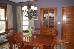
Benjamin Moore Kasbah AF-640 to be specific.  The furniture did not change, but doesn’t the room look so much more pulled together?  It’s so soothing!

I love how the beautiful woodwork just pops against the new color.  Seriously, is that door amazing or what?!?

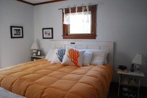
Oh, and speaking of the door, we were also working on the master bedroom and they said they needed a new headboard!   Rather than purchasing a new one, I suggested that they use an extra door and paint it then hang it horizontally…and guess what…they did it!  Doesn’t it look stunning?

Note to self: Do not go up to your son’s Lacrosse coach in front of a bunch of other Mom’s (none of which were his wife / my client)  and say how much you really love how his headboard turned out.  Um, yeah, we got a few funny looks!  I guess that’s just the part of my job…RUMORS!

1